THE POINT

So what was the point?

Good question.

Let me first tell you what was not the point, years ago, when I started working on this idea.

Not the point was trying to mimic a monochrome camera. That would have been pointless, since you can't. The true monochrome camera will always win. There's no way to beat it or even to get to the same level. The simple explanation: the information levels are not the same. In the color photo there's always an amount of guessing going on, to restore missing information. And no matter how good the guesses are, they will never be perfect. In other words: where the monochrome camera doesn't need restoration, the color camera does. You can get close perhaps, but not the same.

It was an inspiration though, that first Leica monochrome camera. It made me think about the differences between a monochrome camera and a color camera, and what could be a feasible approach to get as close to it as possible, when given a color DNG.

Under the knowledge that half of the color DNG was already monochrome (the green sensels), it seemed rather silly to me to spoil those virgin greens with red and blue, and then try to make them monochrome again through a black & white conversion. Why not keep the 50% as they are (you're already half way there) and then try to get the reds and blues turned into proper greens, to get to a 100%?

Voila. There was the idea.

Now let's be very clear here, cause I am a bit nutty but not totally stupid. I do realize that a color interpolated photo still gives you access to the green pixels. Just take the green plane and be done with it! But the difference: that plane has gone through some changes. It's not the direct luminance of the sensor anymore. Color profiling, white balancing and the original is gone. Let alone any other method that was used to clean up the result. I also know you can transform a color photo to another color space and get to a luminance result that way. But this was not what I wanted: I wanted the luminance straight from the sensor and keep it as RAW as possible. I was aiming to reconstruct a DNG if you will, not tear apart a color result. Is the end result any different? Well, maybe not. I didn't compare, because I have no access to the inner magic of Photoshop or Lightroom or other software out there and wouldn't be able to tell what made the difference (if any).

So, the point was simple: to establish if I could get better results directly interpolating on the raw sensor data, focusing on the greens (on a sensor that's the luminance portion), compared to a full color interpolation turned black and white.

But that question was way more difficult to answer than I had anticipated. And as of yet, I really can't tell if this method is better or worse (apart from the problem of how to define 'better' and 'worse'... it's all rather subjective), because I have no direct comparison. I process my color photos only in Lightroom, and I have no idea what interpolation Adobe is using. And yes, I feel DNGMonochrome delivers more than Lightroom does, when it comes to black & whites. But that might be solely due to the fact I'm using different interpolation algorithms than Lightroom is using (and of course I'm biased, after pouring my blood, sweat and tears in this piece of software).

Lightroom seems very close to LMMSE. And when I use that one in DNGMonochrome, I feel an equal sense of loss.

So is it the method itself or is it the tools being used by the method? I think it's the tools.

And there are some downsides to this approach: there's no good way to tackle some aspects of distortions the color photo brings to the monochrome result (despite only focusing on the greens). Things like moire or fringing can have an ugly effect in the monochrome version, but can't be fixed anymore.

So why do I keep using it anyway? Because - placebo as it might be - I still feel the results look better.

But perhaps equally important, at least to me: with DNGMonochrome I have a more clear grasp on what the light was actually doing. It produces the monochrome result the way it hit the sensor. There's no white balance or color filtering through 12 different color sliders. Because in the end that makes it totally unclear (to me at least) what the original actually should look like (according to ones subjective truth and the technical architecture of the sensor used). The additional color filtering on red and blue in DNGMonochrome is logical and follows the rules photographers are (were?) used to. Put a red filter in front of your lens, shoot some black & white film, and you'd see what you see in DNGMonochrome. I have no idea what a magenta, purple or yellow slider in Lightroom should do, or how that's even logical, when keeping in mind we are talking about luminance. Or turn your photo black & white in Lightroom and then change the white balance. Crazy effects. Seriously cool, I'm not being sarcastic. But it doesn't work for me. There should not be white balance in black & white. It somehow forces you (me) to still imagine the colors underlying the black & white. I feel lost, trying to get to a black & white photo that way. So, give me Lightroom and a color DNG, and within no time my black & white photo looks like an alien mess and I'm doubting between 20 different results that all sort of look okay to me. Too many choices and unclear what the actual basis was. What did the camera record? With DNGMonochrome at least I know.

But that might just be me.

On the other hand, if you recognize this color slider madness on your black & whites in Lightroom or other RAW converters... give DNGMonochrome a try. It's free!

In contrast, the DNGMonochrome approach is simple, logical, restrictive, consistent and comes closest to a digital black & white film in your color camera. A bit of a purist approach I suppose. I also have it from an award winning source, who uses DNGMonochrome to match his or hers M color photos with his or hers M-monochrome photos, that this approach works for not just me.

The rest is up to you.

ON THE ALGORITHMS USED IN DNGMONOCHROME

I have to remind you that we're pixel peeping. All the stuff discussed here needs at least 400% magnification to become visible. When it comes to algorithms, it's more nerdy and less photography. But well... when in pursuit of 'the best', it can't harm to focus on the extreme details.

VNG - Variable Number of Gradients - up till now it was the only algorithm used in DNGMonochrome and it is fully implemented (the previous one had a few tweaks that have disappeared). VNG is strong on diagonals and arcs, deals quite well with noise and isn't too bad when sharpening with Lightroom. Weak point: it can zipper on highlighted edges. Other qualities: it's medium fast in execution and medium in memory consumption during execution.

ACP - Adaptive Color Plane - I like ACP. It's one of the simplest of the algorithms I have implemented. It's fast, it's gritty, it's very strong on horizontal and vertical edges. Weak point: it can mess up diagonals (saw tooth like anomalies or 'jaggies'). It's also one of the more noisy ones. If you want to get smoother results, use ACP-D, VNG or LMMSE. When sharpened up it's comparable to VNG, but overall it's less soft than VNG (mind you, 400% to 800% magnification, else you won't see the difference). Other qualities: very fast in execution and low in memory consumption during execution.

ACP-D - since version 1.3.0 - Adaptive Color Plane Directional - It's the ACP algorithm (see previous one) but it takes the first step (and only for the green plane) from another algorithm, called 'Directionally Weighted Gradient Based Interpolation'. That specific algorithm is actually patented (as far as I can tell), so I couldn't implement it separately. Out of the 4 or 5 steps of DWG (when it determines the green plane), I took the first step. In stead of looking in two directions (horizontal and vertical), like ACP does, ACP-D looks in four directions, thus better able to determine how to act on edges. I only implemented this step for the green plane. However, after discovering this directional method and not being able to implement DWG, I got a bit stuck, since what to do with those four directions and how to determine the actual pixel value? Until I discovered that PPG, implemented in e.g. dcraw, seemed to use the same directional method. I then used the PPG method for determining the actual green value (after the best direction is established). The red and blue plane (for filtering) are done the same way as ACP. Those planes could also be adapted to look in four directions, but since they are less important (only used optionally in filtering), I felt that wasn't necessary. So ACP-D is a bit of a mix of DWG / PPG and ACP. ACP-D, when compared to ACP, can produce slightly better diagonals (less jagged), but downside is that the overall image is slightly softer (mind you, 400% to 800% magnification, else you won't see the difference). I'd say that regarding softness (or sharpness), ACP-D sits between ACP and VNG. Weak point: it can still mess up diagonals (saw tooth like anomalies or 'jaggies'), but less so than ACP. ACP-D is already slightly smoother than ACP, but if you want even smoother results, use VNG or LMMSE. Other qualities: very fast in execution and low in memory consumption during execution.

LMMSE - Linear Median Mean Square Error - LMMSE is the most complex one. It sharpens up very nicely and it's the least noisy one. When I read up on it I realized it was partly the implementation I had been searching for (under the theoretical assumption that the color channels should be able to 'help' reconstruct the green channel in a more profound way than the other algorithms did - I was convinced that could be a strategy, but I had no clue how). However, despite the fact you can't argue a lot with the results, it's my least favorite one. To me it looks very much like a Lightroom photo turned black and white. I think it's just a bit too smooth for my taste. No grittiness or a bit of bite. Maybe the noise gets eradicated too well. However, don't let my opinion hold you back. Especially on high ISO photos, LMMSE might be the one best suited. Weak point: on high frequency patterns (e.g. fine fabric or sparkling highlights), when really zoomed in, it can sometimes look a bit speckly. Other qualities: Very slow in execution and very high in memory consumption during execution.

AHD - Adaptive Homogeneity Directional - SCRAPPED - really last minute (before the release of version 1.0.0). But this is 'inside' so I don't mind telling you about it. It just didn't work out between me and AHD. I've spent literally days on it, trying to convince it it could do better. But no matter what I tried, what I changed, how I compared my implementation of it to other implementations out there, how I yelled, screamed and begged, it just wasn't paying off. Mind you, on the surface it looked fine. As a lot of stuff does. Acceptable up to 200%. This could be me being overly critical (I do have a tendency to nag). It has strong edges, solid arcs... but then, when zooming in... especially in noisy areas... wurmy, squiggly, maze patterns. Like a Van Gogh painting. Sharpening in Lightroom made it even worse. Patterns everywhere, like the photo was behind broken glass. I still don't have a full grasp on the 'why' - and in writing software I never exclude that I'm messing up - but since AHD was designed to tackle color artifacts (and seeing the tricks it performs in the background), I suspect this is simply not a very good one for only monochrome. In my final round of tests and after spending another day or so on just AHD, I decided that enough was enough. Can't do this to photos, even if you only see it under a magnifier. So I dumped AHD. If I do get a grip on it, or have a eureka moment, it might be back in a future update.

Bicubic - since version 1.2.5 - Bicubic is a simple algorithm, capable of producing smooth and low noise results. However, a clear downside is that it's not strong on fine detail and quite soft compared to the others (especially when compared to ACP). It can also zipper quite badly on contrasty edges. My advise is to not use it as the main algorithm, but to consider it only as an option in the interpolation squares. The problem is that Bicubic does not use the additional available information to reconstruct a luminance result. For instance, when filling in a green value for red or blue, it only relies on the information from the surrounding green pixels, contrary to all the other algorithms. And when it does this, it doesn't really care which direction is providing the better information. Such a lack of direction will inevitably lead to trouble on edges. Overall the results can be quite acceptable though, depending on the scene, and it might be a useful algorithm on some parts of the photo (through the interpolation squares). Weak points: soft and not very strong on fine detail. Can zipper on contrasty edges, which will show especially when sharpening. Other qualities: Very fast in execution and very low in memory consumption during execution. Also note that due to the nature of this algorithm, noise reduction in the red/blue channel is useless for the luminance result and will not show any changes. Red/blue noise reduction is only useful with this algorithm if you mix in red and/or blue.

Reducing to 50% width and height - Technically this is no demosaicking algorithm. There's no interpolation. It's a very simple procedure, where 75% of the sensels get scrapped (all the red, all the blue and 25% of the greens). What's left is a 'true' monochrome DNG, but based on only a quarter of the sensor information. I added this one more or less as a 'fun' option - or to quickly check up on the color mixing - but if you're not into producing big size photos, this setting may work for you. Also, after implementing a few of the huge sensors in some Fujifilm models (like the GFX 100, with its 100mp sensor): for those cameras you essentially end up with a 25mp monochrome DNG, which is really quite respectable (even if a medium format camera was not meant to produce such a 'small' size). Weak point: obviously... your sensor is reduced and 75% of the information is wasted. And since I do not touch any of the green sensels that are left, diagonals can look quite harsh (no anti-aliasing going on) if you zoom in one step too far. Since version 1.2.9 I've added an option to use the average between G1 and G2. When using that setting more information of the sensor is used (50%) and it produces slightly softer images and less harsh edges.
Other qualities: Very fast in execution and very low in memory consumption during execution.


From a purist perspective

Implementing AHD and LMMSE wasn't easy. Especially AHD gave me a lot of trouble and I couldn't get it right (or it just isn't suited), which explains why I scrapped it (see above). LMMSE gave me less trouble. However, LMMSE touches the original green sensels. It's - like AHD - primarily designed to produce a color result, and doesn't stick to the 50% green in the end result. The end result is still fine, obviously we're not talking big differences here, but if your desire is to stay as close to the original sensor data as possible, stick to VNG, ACP, ACP-D or, if you do feel the need, Bicubic.

GREEN DIVERGENCE

This has been an issue from the start.

Most algorithms assume G1 and G2 in the Bayer layout are more or less the same value, or at least hold a correct value. In practice this is not the case. The divergence between G1 and G2 is a result of influence from the other channels (red or blue). This was very apparent on the Leica M8 and M9, where all the algorithms produce highly visible maze patterns in areas where red is dominant. One of the greens on the CCD of these Leicas is clearly influenced by what's happening in the red channel. The M8 is more sensitive to this problem than the M9, but both are problematic. It does seem to be mostly a problem on CCD sensors and older cameras. The more recent Leica CMOS cameras (and other brands like Canon, Nikon and Sony) are less prone to the problem.

By now I've improved the algorithm that tackles this problem. The easiest solution would have been to balance the greens out. Most algorithms probably do this up front. I didn't want to do that. Keep the greens as close to 50% as possible and not simply eradicate 25% of it, when they're only an issue in red areas. Apart from trying to concentrate on specific areas of the photo, I also wanted some variable weight in it, because this problem is not only dependent on the camera used, but also on the algorithm used.

The problem here is that it's hard to find the right amount of correction, since it's unclear per sensor under what conditions the greens diverge most or where in the photo the algorithm suffers most from the divergence (shadows, highlights, mid tones, certain colors etc). I can't blame commercial implementations overdoing this, just to be on the safe side. It's impossible to inspect every sensor and to come up with a workable solution that works perfectly on all sensors. The alternative (my approach) is to leave it partly to the user. Which is dangerous, since you might never read any of this or just gloss over the issue, introducing patterns in your photos.

Well, at least I tried...

So the new DNGMonochrome contains a special module, where this stuff can be set and changed per camera and per algorithm. It's set already by me to some defaults I think are okay for some cameras. But since my testing is limited to only a few photos per camera, I can't fully judge every situation in which this problem might show.

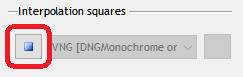
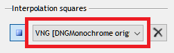
You can change the correction in the 'Green divergence' window, through this button. On the left side of the program, at the bottom.


However, the correction itself can also have adverse effects. Move the sliders to a higher setting only if you notice patterns as 
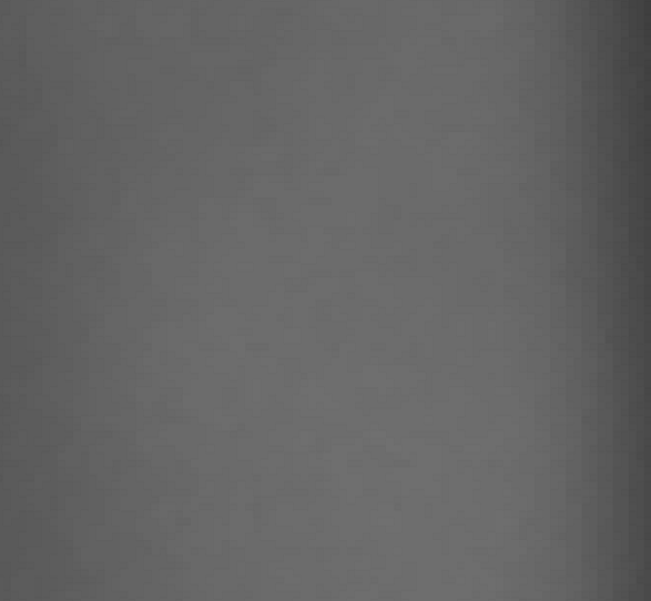
shown in the following image, usually in originally red areas (you will have to pixel peep and zoom to 400% - 800% to notice it). Keep the slider as low as possible. I do urge you to check for this problem on any photos with obviously red patches in it. Once you found the right setting, following photos you convert will behave accordingly.


800% magnification of a red patch, interpolated with the scrapped AHD uncorrected (Leica M9)... note that other algorithms might show slightly different patterns, but as obvious...


800% magnification of the same red patch as above, interpolated with the scrapped AHD, after correcting with the slider for green divergence (Leica M9)...


If you do not notice any problems, leave the sliders to the default setting or experiment with sliding them to lower and possibly to 'off' (run a new conversion after changing any of these settings, and check the result again...).

Correction is definitely needed on the Leica M8, Leica M9 and Leica S (typ 006). The sliders are already preset for those cameras (and for some others). On most cameras the compensation is set to a very conservative default, focusing on red overspill. Turning them off might work or you may need to increase the value.

The color options (the check boxes 'red areas' and 'blue areas') are used to compensate in areas that are either predominantly red or predominantly blue (or both) and turning them on (or one of them) avoids compensating in areas that don't need it. I've only seen this problem pop up in red areas (except on the Leica M8), so the 'blue areas' seems redundant and can probably be left set to 'off'. But again: I don't know how every sensor behaves... might come in handy. Note that if you change the color options, you might have to adjust the sliders.

INTERPOLATION SQUARES

So, I was going back and forth between these algorithms, being frustrated about parts of some photos working better with algorithm A, when I felt the total photo looked better with algorithm B or C, when it suddenly dawned on me: why can't we interpolate photos with more than one algorithm? Why is it a choice up front and then you're stuck with it for the total photo? Let alone programs like Lightroom, that don't want to bother you at all with this stuff and don't even give you a choice up front (or 'at all').

Well... I can think up a few reasons why. Good reasons (please read till the end to inform yourself about the possible drawbacks).

But not good enough reasons to hold back my nerdy brain waves.

So I decided to do it.

Yes.

In the new DNGMonochrome you can interpolate one DNG (the same DNG) with all the provided algorithms.

Different parts can be interpolated differently.

It's quite simple really. Something you could also achieve with an elaborate copy/paste after you interpolated the same photo with different algorithms.

But my implementation seems simpler.


So how does it work?

First you put the program in 'square mode' by clicking this button (on the right side of the program).


Then, when you move over the photo, you'll notice the hand symbol has changed into a square.

Click anywhere on the photo where you want to use a different algorithm than the original and a square will appear.
Note that currently you can't 'draw' a square. It's just the one click.

Be aware that the initial square is always a fixed size. If you're zoomed in to 400 or 800 percent, the edges of the square won't be visible. You're 'in' the square. Zoom out to actually see it.

Once you placed a square, you can drag it around or change its size. It will already state the original algorithm in the top left corner. Now go back to the dropdown next to the square button, which is now accessible...


... and select the algorithm you want to use in your square. The initial selection will be the same as the original algorithm you used for the conversion.

You can click as many squares as you like. You change the algorithm of the square by selecting it (clicking in it). Selection will show by a thicker edge. If you change the dropdown with multiple squares in the photo, it will always be the selected square (none other) that changes.

Once you're done and want to get back to the regular photo, click the square button again. You'll then be out of 'square mode'. You can still see the squares - faintly blue, and they will retain the algorithm you selected for the square - but you can't move them, select them or change them. For that you have to get back to 'square mode' (by clicking the button again).

You can get rid of the selected square by clicking the 'delete' button, next to the dropdown list.

Some other quick notes:

o When you're in 'square mode' you can still drag the photo (and not the square) by holding down the Shift-key
o Squares will 're-interpolate' when you move them or resize them... they will briefly turn orange
o Squares will 're-interpolate' also in other stages (e.g. when using the noise reduction or right before saving)
o Since this is a first version, bugs will no doubt rear their ugly heads... if the content of the square seems 'off', try to drag it or resize it or delete it and place a new one.


Upsides

Let me give you an example: ACP is strong on horizontal and vertical edges, since it interpolates along them. As a consequence, it's not very good on diagonals. They tend to look a bit stepped, jagged, not very well anti-aliased. Quite logical if you look at the design of ACP. With VNG it's reversed. That one is quite good on diagonals, but less strong on vertical and horizontal edges, where it tends to zipper. So... do the photo with ACP, and attack any diagonals that bother you with a touch of VNG. Problem solved. Or if you like LMMSE for your noisy photo, but discover some speckles in certain areas, touch it up with VNG or ACP. With a bit of luck, the problem is solved. But well... if you downscale your end result or do not intend to print really large... who's gonna notice anyway? This is all stuff of nerds.


Downsides

Well, the obvious one... the border of the square is very strict. There is currently no feathering going on (I'm still looking into that possibility). So the biggest risk is that you start seeing the edges of the square in the end result. This might happen especially if the interpolation algorithms are far apart and on very noisy photos. LMMSE for instance, is already quite smooth in its interpolation and leaves less noise behind than the others. If you were to use LMMSE in a square on a noisy photo, done with e.g. ACP, the square might stand out in the end result.

So my advise is to use this system with caution, preferably on small parts of the photo that really benefit from a different algorithm and when interpolating the total DNG with that algorithm isn't preferred. Be especially cautious on high ISO photos.

Another downside: DNGMonochrome doesn't save any type of 'project' file. If you clicked-in 30 squares and are truly happy with them, once you produced your end result and close DNGMonochrome, a next time around your 30 squares will be gone. So a 'redo' is complicated, if not impossible. You'll have to remember what you did. Perhaps in the near future I might introduce some kind of 'project file', to hold on to the state of your labor, but currently there is none.